In today’s digital age, having a mobile-friendly website is crucial for any business or personal website. With the increase in mobile device usage, it is essential to optimize your website to make it easily accessible and user-friendly for your visitors. Google Sites is a great platform for website building, and in this blog, we will discuss how to make a Google Site mobile-friendly using mobile optimization techniques.
Use a Responsive Theme
The first step to making your Google Site mobile-friendly is to use a responsive theme. A responsive theme automatically adjusts the layout of your website to fit the screen size of the device being used. This means that your website will look great on desktops, laptops, tablets, and mobile devices. To choose a responsive theme, go to “Theme” in the right-hand menu and select “Change Theme.” Look for themes that are labeled as “responsive” or “mobile-friendly.”
Simplify Navigation
Mobile devices have smaller screens, which means that there is less space for navigation menus. Secondly, To make your website easy to navigate on a mobile device, simplify your navigation. Use fewer menu items and make sure they are easy to read and access. You can also use drop-down menus to save space.
Optimize Images
Images are a vital part of any website, but they can slow down the loading time of your website, especially on mobile devices. To optimize your images for mobile devices, reduce the file size of the images without sacrificing quality. Moreover, You can use image optimization tools like Adobe Photoshop or online tools like TinyPNG to reduce the file size of your images.
Start building your online presence today with Google Sites and reach your target audience like never before.
Use Shorter Paragraphs
Reading long paragraphs on a small mobile screen can be challenging, so it’s essential to use shorter paragraphs on your website. Break up long paragraphs into shorter ones and use headings to make it easier for users to skim your content.
Test Your Website
After making the above changes, it’s crucial to test your website on different mobile devices to ensure that it is mobile-friendly. You can use Google’s Mobile-Friendly Test tool to check if your website is optimized for mobile devices. Moreover, The tool will analyze your website and provide feedback on what changes you need to make to improve your website’s mobile-friendliness.
In short, making a Google Site mobile-friendly is crucial for ensuring that your website is accessible and user-friendly for visitors using mobile devices. Lastly, By using a responsive theme, simplifying navigation, optimizing images, using shorter paragraphs, and testing your website, you can improve your website’s mobile-friendliness and provide a better user experience for your visitors.
Benefits of Making a Google Sites Mobile-Friendly
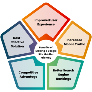
Making a Google Site mobile-friendly has several benefits, both for the website owner and the visitors. Here are some of the advantages of making a Google Site mobile-friendly:
Improved User Experience
A mobile-friendly Google Sites provides a better user experience for visitors using mobile devices. With a responsive design, the website layout adjusts automatically to the size of the screen, making it easy for visitors to navigate and read the content.
Moreover, Kha Creation can help improve user experience by providing website design services that prioritize responsive design, easy navigation, and optimized content, resulting in a website that is easy to use and engages visitors, leading to increased traffic and conversions.
Increased Mobile Traffic
More and more people are using mobile devices to access the internet, and having a mobile-friendly website can increase your website’s mobile traffic. When your website is easy to use on a mobile device, visitors are more likely to spend time on your website and return in the future.
Moreover, Kha Creation can help increase mobile traffic by designing a mobile-friendly website with a responsive design that adapts to different screen sizes, resulting in a website that is easy to access and navigate on mobile devices. This, in turn, can lead to increased mobile traffic and improved search engine rankings.
Better Search Engine Rankings
Google has made it clear that mobile-friendliness is a ranking factor for websites. A mobile-friendly Google Site has a higher chance of ranking well in mobile search results, increasing the visibility of your website.
Moreover, Kha Creation can help improve search engine rankings by optimizing website content, including keywords, meta descriptions, and tags, as well as creating a mobile-friendly website with a responsive design that meets search engine standards. This can result in better search engine rankings and increased visibility for the website.
Ready to take your online presence to the next level? Create a website with Google Sites today.
Competitive Advantage
Not all websites are mobile-friendly, and having a mobile-friendly Google Site can give you a competitive advantage. When visitors have a positive experience on your website, they are more likely to choose your business over a competitor.
Moreover, Kha Creation can help create a competitive advantage by designing a website with a unique and engaging design, optimized content, and a responsive design that ensures an easy-to-use experience across all devices. This can help the website stand out from competitors and attract more visitors, leading to increased traffic and conversions.
Cost-Effective Solution
Creating a separate mobile version of your website can be costly and time-consuming. Moreover, Making your Google Site mobile-friendly is a cost-effective solution that ensures your website is accessible to visitors using mobile devices without the need for a separate mobile website.
Moreover, Kha Creation can help provide a cost-effective solution by designing a mobile-friendly website that eliminates the need for a separate mobile version, saving time and money. Additionally, optimizing website content and design can improve website performance and reduce the need for expensive paid advertising, resulting in a cost-effective solution for website owners.
FAQ on Make a Google Sites Mobile-Friendly:
What is a mobile-friendly website?
A mobile-friendly website is a website that is designed to be easily accessible and user-friendly on mobile devices like smartphones and tablets. It should have a responsive design that adjusts the layout of the website to fit the screen size of the device being used.
How do I make my Google Sites mobile-friendly?
To make your Google Site mobile-friendly, you should use a responsive theme, simplify navigation, optimize images, use shorter paragraphs, and test your website. By doing these things, your website will be easier to use on mobile devices.
Why is it important to have a mobile-friendly website?
It is important to have a mobile-friendly website because more and more people are using mobile devices to access the internet. Moreover, A mobile-friendly website provides a better user experience for visitors using mobile devices, increases mobile traffic, improves search engine rankings, and provides a competitive advantage.
How do I know if my Google Sites is mobile-friendly?
You can test your Google Site’s mobile-friendliness using Google’s Mobile-Friendly Test tool. The tool will analyze your website and provide feedback on what changes you need to make to improve your website’s mobile-friendliness.
Can I make a Google Sites mobile-friendly without changing the desktop version?
Yes, you can make a Google Site mobile-friendly without changing the desktop version. Moreover, By using a responsive theme and optimizing the website for mobile devices, you can make the website mobile-friendly without changing the desktop version.
Will a mobile-friendly website affect my search engine rankings in Google Sites?
Yes, having a mobile-friendly website can improve your search engine rankings. Google has made it clear that mobile-friendliness is a ranking factor for websites, so having a mobile-friendly website can improve your website’s visibility in search engine results.
How do you write mobile-friendly content?
Writing mobile-friendly content involves creating web content that is easily readable, accessible, and engaging on mobile devices. To achieve this, you should focus on concise and scannable text, clear headings, short paragraphs, legible fonts, and incorporating visuals that fit well on smaller screens.
What does mobile-friendly mean?
Mobile-friendly refers to web content, design, or websites that are optimized for viewing and interacting on mobile devices such as smartphones and tablets. It ensures that users have a seamless and positive experience regardless of the device they’re using.
Why is mobile-friendly content important?
Mobile-friendly content is crucial because a significant portion of internet users access websites and consume content on mobile devices. Lastly, If your content isn’t optimized for mobile, you risk alienating a large portion of your audience, leading to higher bounce rates and lower engagement.
What are the elements of mobile-friendly content?
Mobile-friendly content includes elements such as responsive design (adapting to different screen sizes), easy-to-read fonts, well-structured headings, short paragraphs, minimal use of large images or media, fast loading times, and touch-friendly buttons and links.
What is an example of mobile content?
An example of mobile content could be a blog post that has short paragraphs, clear subheadings, and uses visuals that are appropriately sized for mobile screens. It should also load quickly and have buttons that are easy to tap on a touch screen.
How do I make my website mobile-friendly?
To make your website mobile-friendly, you can follow these steps:
- Choose a Responsive Design: Use a responsive design framework that automatically adjusts your website’s layout and elements based on the screen size.
- Optimize Images and Media: Compress images to reduce file size without compromising quality. Use responsive media queries to ensure media elements adjust to different screen sizes.
- Use Legible Fonts: Select readable fonts that scale well on smaller screens. Avoid small font sizes and use a font size that’s comfortable to read on mobile devices.
- Simplify Navigation: Streamline your website’s navigation by using collapsible menus or a single menu button that expands when tapped.
- Prioritize Content: Place the most important content at the top and avoid clutter. Break up long paragraphs, and use bullet points and lists to make reading easier.
- Test on Different Devices: Regularly test your website on various mobile devices and browsers to ensure consistent performance and appearance.
- Minimize Pop-ups: Avoid intrusive pop-ups that can be difficult to close on mobile devices, as they can frustrate users.
- Optimize Loading Speed: Minimize unnecessary scripts and code to improve loading times. Mobile users expect fast-loading pages.
- Use Touch-Friendly Elements: Ensure that buttons, links, and interactive elements are appropriately sized for touch input.
- Provide a Mobile Viewport Meta Tag: Add a viewport meta tag to your HTML to control how your website appears on different devices.


-p-500")
